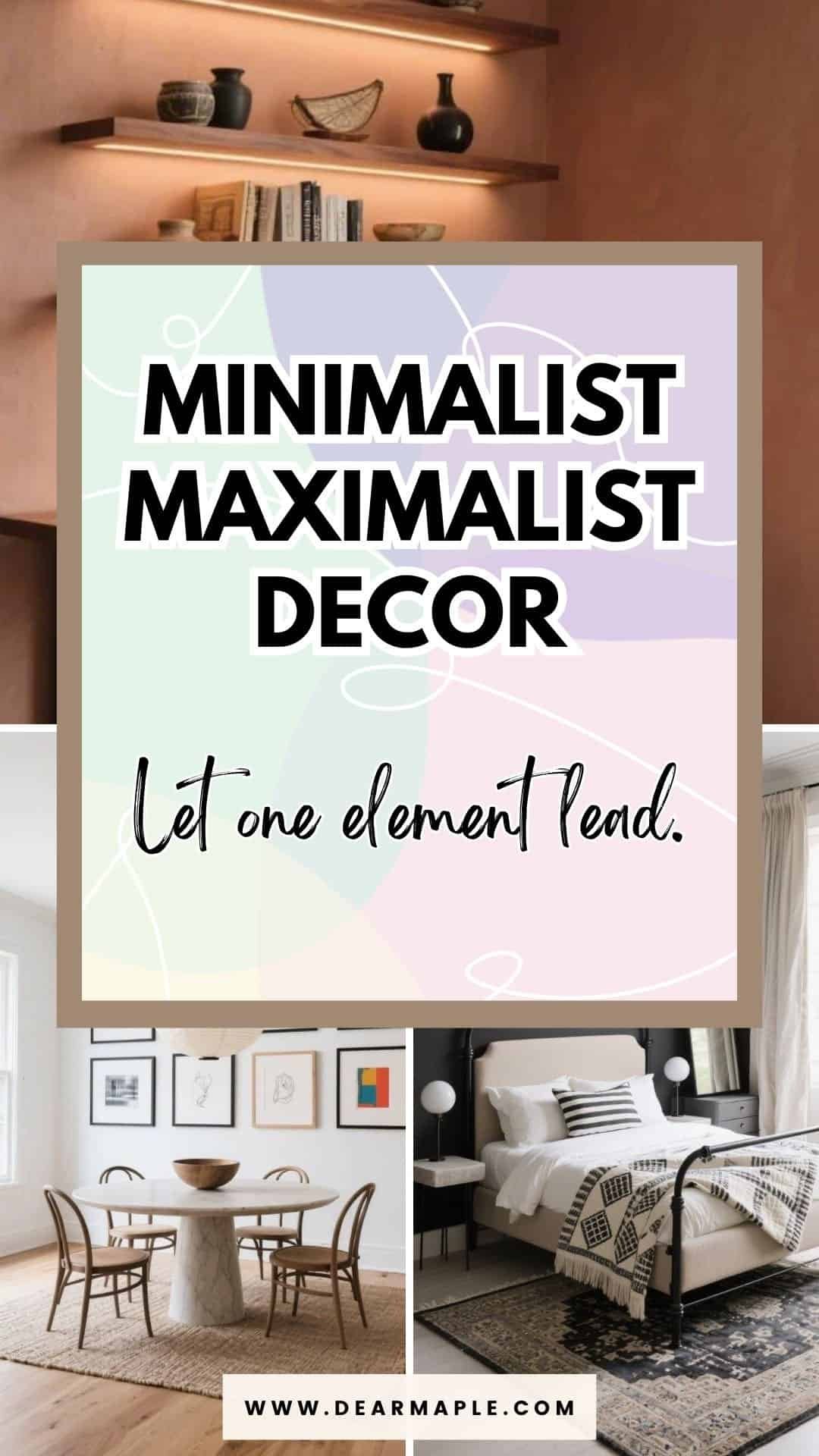
Ready for a paradox that actually works? Let’s blend the calm of minimalism with the joy and personality of maximalism—without turning your home into chaos. Think clean lines, curated statements, and bold moments that breathe.
I’m walking you through seven complete room designs that nail this balance. Each one is a full, ready-to-copy vibe—colors, furniture, decor, and those special touches that make it feel intentional, not cluttered.
Why This Balance Is Trickier Than It Looks
Here’s the thing: minimalist maximalist decor sounds cute in theory. In real life? It’s easy to get wrong.
Most people lean too far one way without realizing it. They either keep adding personality until the room feels visually loud and exhausting… or they edit so aggressively that the space ends up looking sterile and flat.
The tension between the two styles is exactly what makes this approach exciting — and exactly what makes it risky.
Minimalism is about restraint. Maximalism is about expression.
One whispers. The other sings.
If you let them compete, your room feels chaotic.
If you force one to disappear, you lose the magic.
The goal isn’t to split the difference. It’s to let them take turns.
That’s where cohesion comes in.
The Real Problem Isn’t “Too Much” — It’s Lack of Structure
When a space feels overcrowded, it’s rarely because there are too many items. It’s usually because there’s no visual hierarchy.
Everything is fighting for attention.
Too many colors shouting at once.
Too many shapes repeating randomly.
Too many small objects without an anchor.
Maximalism without structure feels messy.
Minimalism without personality feels unfinished.
But when you build a strong foundation first — neutral base, controlled palette, clear sightlines — you create room for bold choices to actually shine.
Think of it like this:
A gallery wall looks chaotic on a cluttered wall.
The same gallery wall looks intentional on a clean one.
A cobalt velvet chair looks random in a busy room.
That same chair looks iconic in a restrained space.
Cohesion isn’t about limiting creativity. It’s about directing it.
How to Make Contrast Feel Intentional
There are a few quiet rules behind every cohesive minimalist maximalist decor scheme. You don’t see them at first glance — but they’re doing all the heavy lifting.
First: visual anchors.
Every room needs one or two pieces that ground everything else. A low-profile sofa. A sculptural table. A large art piece. Without anchors, bold details float around and feel accidental.
Second: repetition.
When you repeat a material, tone, or shape at least three times, your brain reads it as deliberate. One brass lamp feels random. Brass lamp + brass tray + brass frame? Now it’s a story.
Third: negative space.
Empty space isn’t wasted space. It’s what makes your dramatic pieces feel dramatic. If every shelf is full, nothing stands out.
Fourth: scale over quantity.
One oversized piece creates more impact than five small decorative items. Big art. Big plant. Big chair. Then stop.
Minimalist maximalist decor works when boldness is concentrated — not scattered.
Before You Pick a Room, Decide This
If you’re planning to try this in your own space, pause for a second and answer one question:
What gets to be loud here?
Color?
Pattern?
Shape?
Texture?
You don’t need all four.
When everything is loud, nothing is special. When one element leads and the rest support it, the contrast feels effortless.
That’s exactly what you’re about to see in the rooms below. Each design chooses its hero moment carefully — sometimes it’s a saturated chair, sometimes it’s layered textiles, sometimes it’s an entire wall of art. But the supporting cast always stays disciplined.
That’s the secret.
Now let’s get into the rooms.
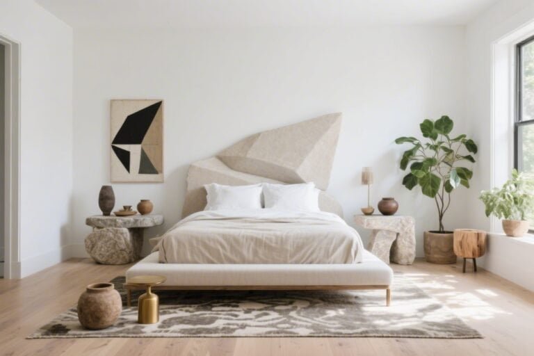
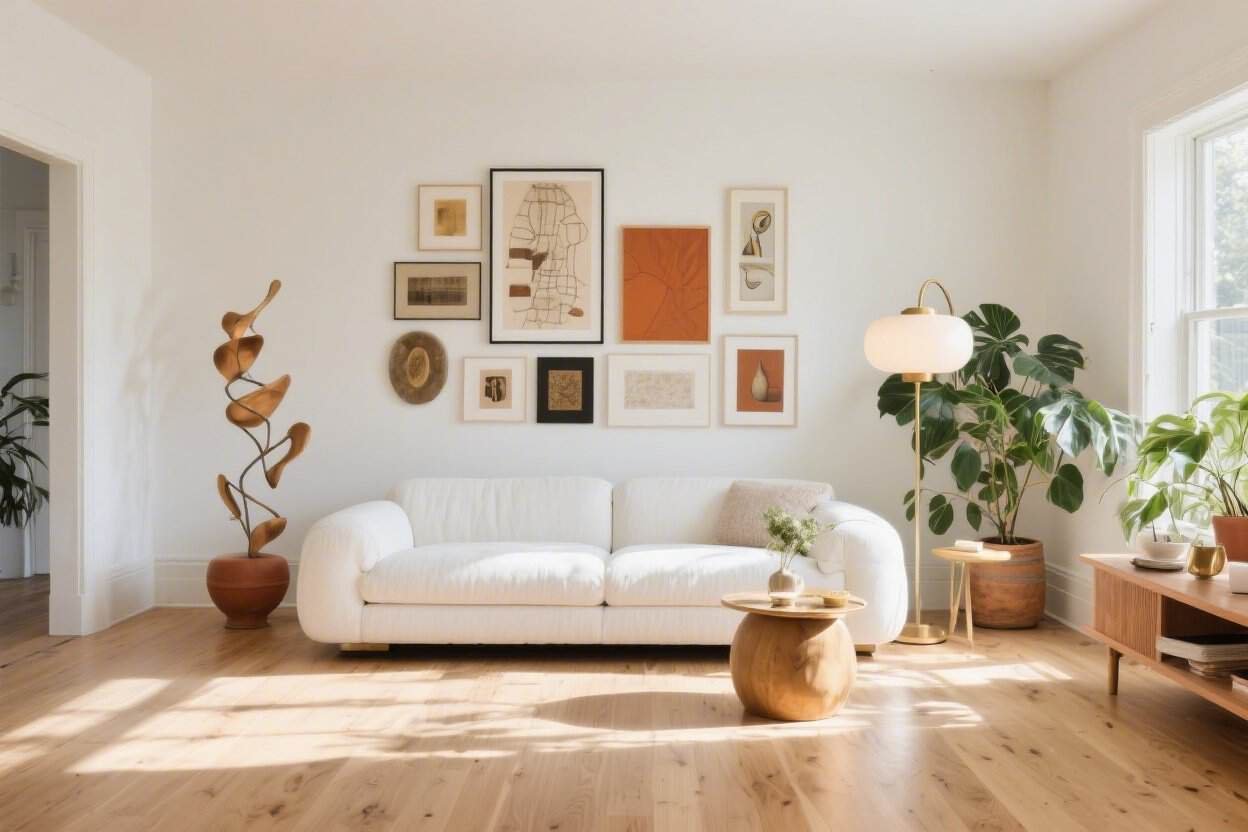
1. Sculptural Neutrals With One Blockbuster Color
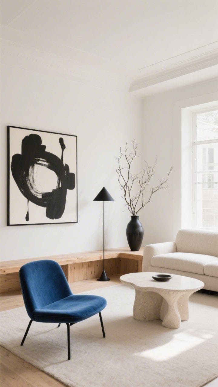
This living room is calm at first glance, then it winks at you. Picture a soft, warm white room with a low-profile linen sofa and a matte-plaster coffee table that feels almost sculpted.
Then—boom—a single electric cobalt velvet chair steals the show. It’s the star, and everything else supports it.
- Palette: Ivory, sand, and wood + one high-saturation color (cobalt or emerald).
- Furniture: Two large, simple anchors; one statement seat; slim black floor lamp.
- Decor: Oversized abstract art in black-and-white; a single vase with dramatic branches.
- Why it works: Minimal base, maximal impact through one hero hue and strong silhouettes.
2. Monochrome Base With Pattern-Rich Textiles
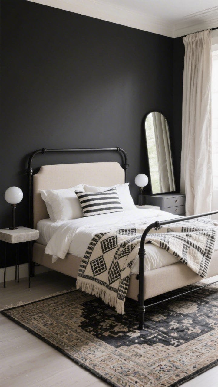
Take a bedroom with a clean, charcoal-and-cream palette. Keep the bed frame super simple—black metal or upholstered in oatmeal. Then go maximal with the textiles only.
Layer a Persian-style rug, striped Euro shams, and a block-printed quilt. The furniture stays quiet so the fabrics can sing.
- Palette: Black, cream, gray, with layered neutrals.
- Furniture: Floating nightstands, sleek sphere lamps, no heavy dressers—use a closet system.
- Decor: One large floor mirror, ceramic vessels, linen drapes pooling slightly.
- Why it works: Patterns cluster in soft goods, so nothing feels heavy or chaotic.
3. Gallery Wall, Bare Floor
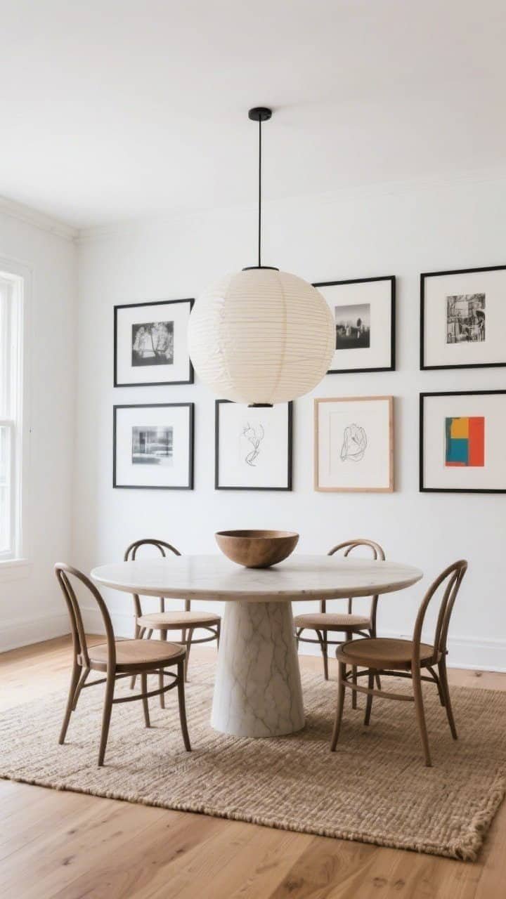
In a dining space, put the drama on the walls and keep the ground light. Build a floor-to-ceiling gallery wall with a tight frame color—think matte black or oak—mixing photography, sketches, and a few bold color prints.
Below it, keep things airy: a round pedestal table, slim wishbone chairs, and a neutral jute rug or even no rug at all.
- Palette: Soft white walls with frames in one or two finishes; art brings color.
- Furniture: Round table to soften all the right angles; open-backed chairs to avoid bulk.
- Decor: One oversized pendant, like a rice paper lantern; a single sculptural bowl.
- Why it works: Maximal vertical energy, minimalist footprint. The room still breathes.
4. Earthy Minimal Shell, Collectors’ Cabinet Energy
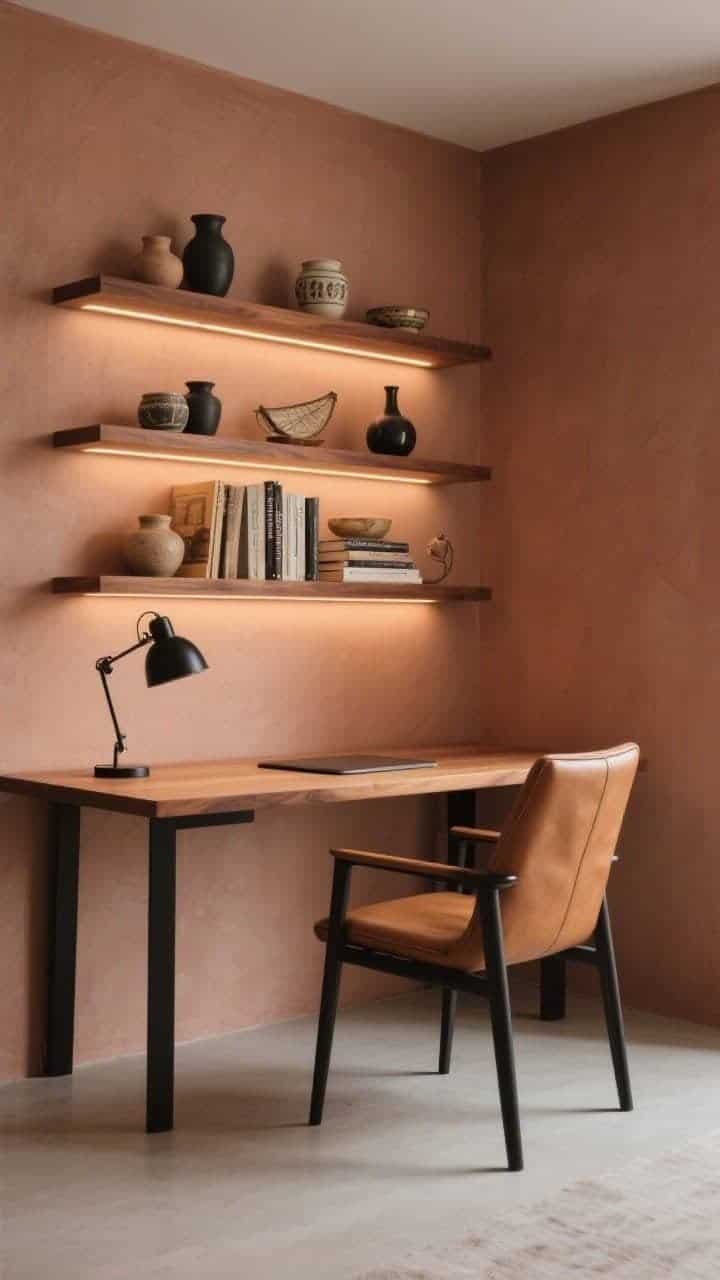
Imagine a home office wrapped in muted clay walls with clean-lined shelves. The desk is minimal—thin wood slab, black legs—but the shelves are a curated wonderland of ceramics, vintage books, and travel objects.
Everything is arranged with negative space between groupings. It feels personal, not packed.
- Palette: Terracotta, taupe, walnut, and matte black.
- Furniture: Slim desk, ergonomic chair in tan leather, floating shelves with integrated lighting.
- Decor: Group in odd-number clusters; keep heights stepped; repeat materials.
- Why it works: The minimal architecture frames maximal personality with discipline.
5. High-Contrast Kitchen With Quiet Storage Drama
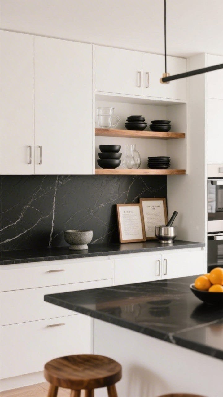
This kitchen balances bold and clean like a pro. Go for flat-front white cabinets with black stone counters and brushed stainless hardware. Then let the open shelf nook bring the flair.
Curate a tight color story: matte black ceramics, clear glass, warm wood, and one accent metal. Keep everything else behind closed doors.
- Palette: White, black, warm oak, and soft silver; accent in olive or rust.
- Furniture: Backless wood stools at an island; low-profile linear pendants.
- Decor: Stacked bowls, a mortar-and-pestle, two framed recipe prints, a bowl of citrus.
- Why it works: Hidden utility + one staged zone = clean function with curated richness.
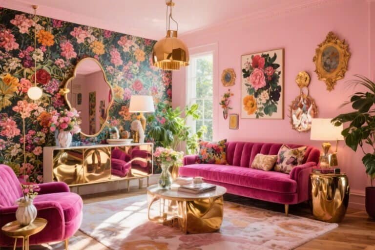
6. Color-Drenched Nook With Negative Space
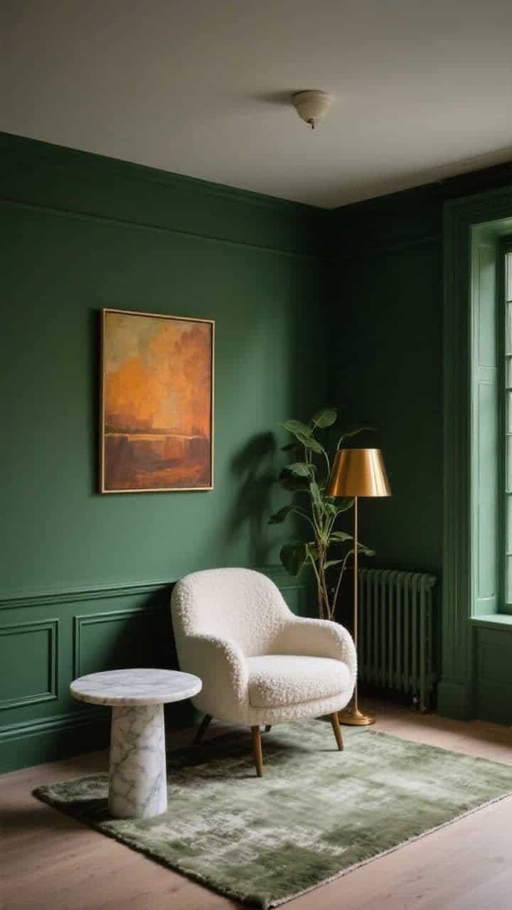
Pick a small reading corner and go all in. Paint the walls, trim, and even the radiator in a deep moss green for a monochrome envelope. Add a curved boucle chair, a tiny marble side table, and a floor lamp with a glossy shade.
On the wall, hang a single oversized oil painting in warm tones. Keep the floor open and the ceiling light simple to prevent visual crowding.
- Palette: Tone-on-tone green with warm amber and brass accents.
- Furniture: One plush chair, petite table, slender lamp—no bookshelves here.
- Decor: Thick wool rug under just the chair; one tall plant to soften corners.
- Why it works: Maximal color, minimal pieces. The volume is in depth, not quantity.
7. Pattern-on-Pattern Entry With Streamlined Utility
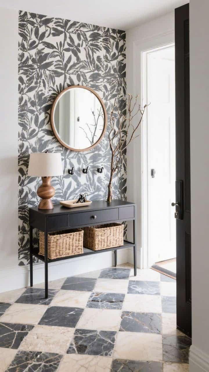
The entryway is your first impression—make it memorable and organized. Start with checkerboard stone tiles in cream and charcoal. Add a bold wallpaper—botanical or geometric—in a limited palette that echoes the floor.
Now counterbalance with simple utility: a slim black metal console, a round wood mirror, and hidden storage baskets beneath.
- Palette: Black, cream, and two accent tones borrowed from the wallpaper.
- Furniture: Narrow console with a single drawer; wall-mounted hooks in a straight line.
- Decor: One sculptural lamp, a shallow tray for keys, and a tall branch arrangement.
- Why it works: Maximal pattern + minimalist furniture silhouette = impact without clutter.
Before you start, remember these quick guardrails to keep things cohesive:
- Pick your hero: Decide what gets to be loud—color, pattern, or shape—and let everything else chill.
- Repeat materials: Echo the same wood tone, metal, or fabric at least three times.
- Edit surfaces: Leave at least 30% of any shelf or tabletop empty.
- Go big, not many: Choose one oversized piece instead of several small ones.
- Mind the sightlines: Keep pathways clear and furniture low where views need to feel open.
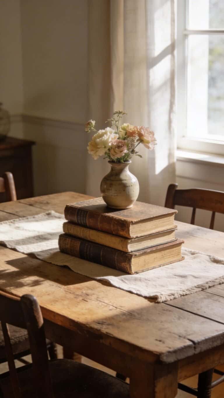
The magic of a cohesive minimalist maximalist decor scheme isn’t about owning more or stripping everything back—it’s about choosing with intention. When contrast is controlled, bold elements feel elevated instead of overwhelming. When negative space is protected, personality feels curated instead of cluttered. That’s the difference between a room that looks busy and a room that feels layered.
Notice how each design above commits to a clear focal point, repeats materials with discipline, and edits ruthlessly. That consistency is what makes the contrast work. Minimalism sets the stage. Maximalism delivers the moment.
If you take one thing with you, let it be this: go big where it matters, stay quiet everywhere else, and always leave room for the eye to rest. Balance isn’t about playing it safe—it’s about directing attention with confidence.
Pick the design that speaks to you, commit to the structure behind it, and trust the restraint just as much as the drama. That’s how you get the charm and the calm—without ever tipping into chaos.