
This post shows The Best Paint Colors for a Warm Neutral Living Room!

🎉 Let’s Talk About Paint Colors (Yes, Really)
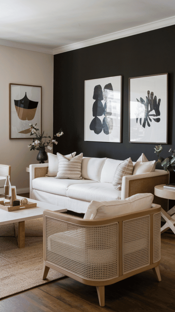
You know that moment when you walk into someone’s living room and it just feels cozy? Like you’ve been wrapped in a soft cashmere blanket and handed a chai latte without even asking? Yeah, that’s the power of warm neutral paint.
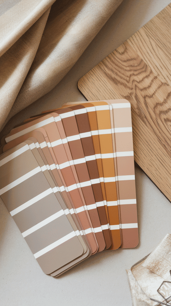
But let’s be honest: picking the right neutral is harder than it looks. Beige isn’t just beige. There’s greige, taupe, mushroom, oat milk foam (okay, I made that one up—but admit it, you’d try it 😅).
If your living room needs a refresh without going full “HGTV reno mode,” a warm neutral wall color might just be the low-effort, high-impact magic you’re looking for. So, grab your coffee and your paint swatches—we’re about to find your room’s new BFF.
The Best Paint Colors for a Warm Neutral Living Room
🎨 What Is a Warm Neutral, Anyway?
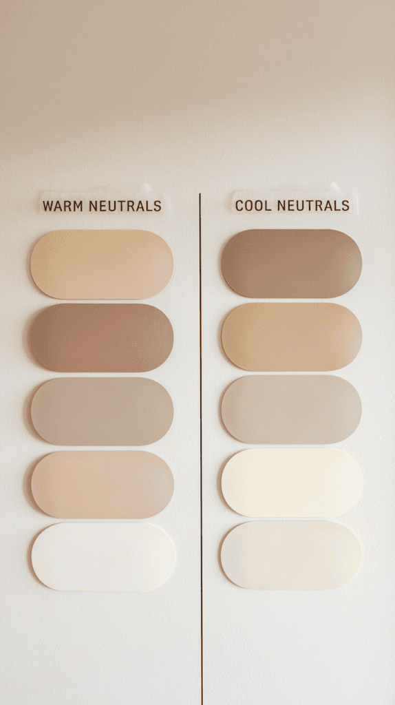
Okay, so let’s clear something up: not all neutrals are created equal. Some feel cozy and calm, while others scream “dental clinic.”
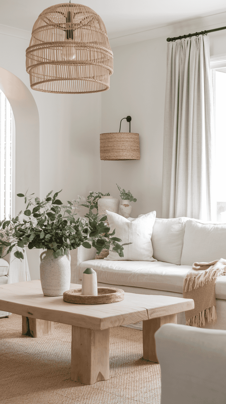
Warm neutrals have yellow, red, or orange undertones that give your room a softer, more inviting vibe. Think creamy off-whites, sandy beiges, and earthy taupes. They play nice with wood accents, soft textiles, and that rattan coffee table you totally impulse-bought (no judgment).
Compare that to cool neutrals—those icy grays and stark whites—and you’ll see why warm neutrals win the “Netflix and chill” aesthetic every time.
Why do people love warm neutrals?
- They work with literally any design style (modern, farmhouse, boho, etc.).
- They’re forgiving in weird lighting situations.
- They make your living room look expensive… without you needing to be.
So now that we’ve set the mood, let’s dive into the colors that make warm neutrals so drool-worthy.
🪴 Soft Beiges: The Timeless Go-To
Ah, beige. It’s like the avocado toast of paint colors—classic, satisfying, and surprisingly versatile.
Now, before you yawn at the word “beige,” let me tell you: the right beige can transform a space from “meh” to magazine-worthy.
Some faves:
- Sherwin-Williams Accessible Beige – soft and cozy with a hint of gray.
- Benjamin Moore Manchester Tan – creamy, mellow, and looks amazing in natural light.
- Behr Navajo White – it leans warm without going yellow. Basically a hug in paint form.
Why choose beige?
- It creates a soft backdrop for bold decor.
- It works so well with wood tones, especially medium to dark stains.
- It won’t fight with your furniture—promise.
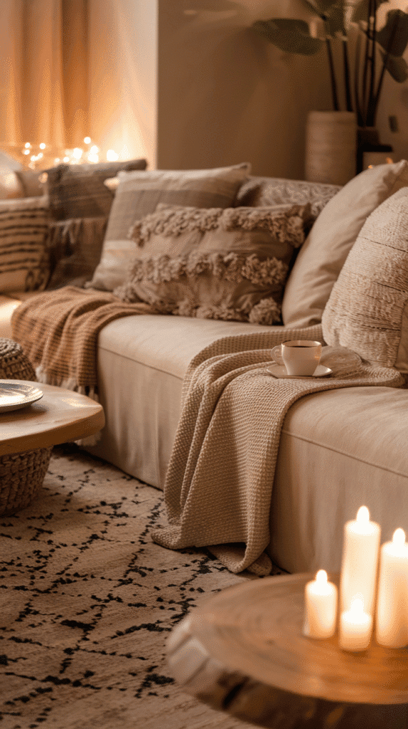
Pro tip: beige looks best when paired with texture—think linen curtains, woven rugs, or a chunky knit throw. Otherwise, it can feel a bit flat (and nobody wants “flat” unless we’re talking screen TVs).
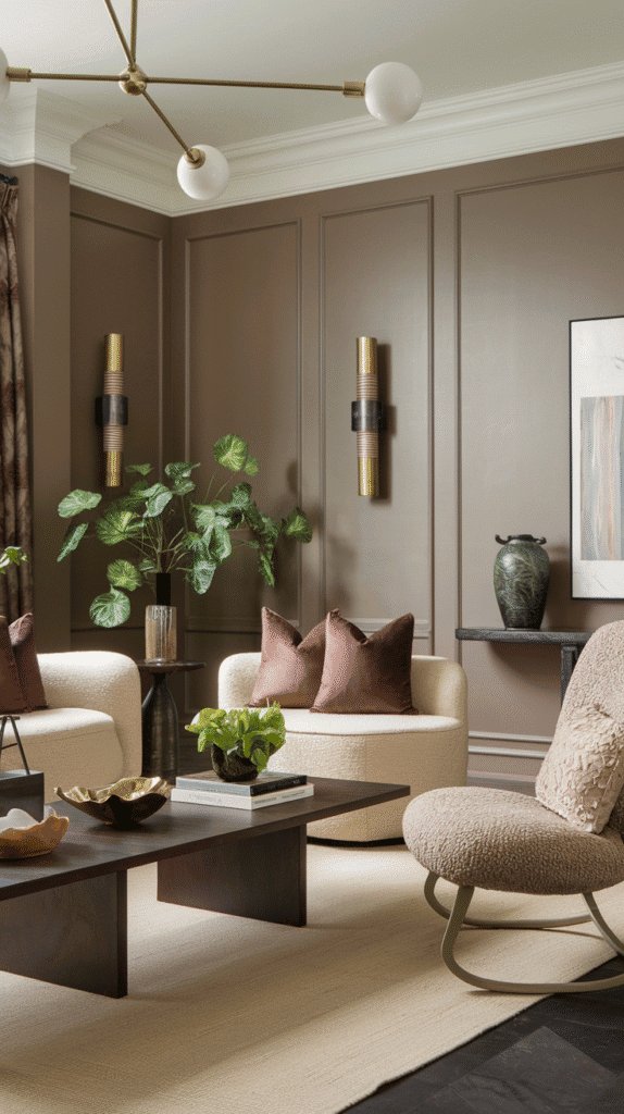
🎭 Warm Greige: The Cool Girl of Neutrals
Ever met someone who’s both chill and stylish? That’s greige. It’s what happens when gray and beige fall in love and have a well-adjusted baby.
Greige = the ultimate balancing act. You get the earthiness of beige with the modern edge of gray. IMO, it’s the MVP of warm neutrals.
Top picks:
- Benjamin Moore Edgecomb Gray – soft, elegant, and ridiculously adaptable.
- Sherwin-Williams Agreeable Gray – one of the most popular for a reason.
- Clare Paint “Greige” – yes, that’s the name. Yes, it’s gorgeous.
Greige plays beautifully with:
- Black metal accents (hello, modern farmhouse).
- Leather furniture.
- Soft blush or sage green accessories.
If you’re nervous about going “too beige” or “too gray,” greige is your paint color comfort zone. And honestly, we all need one of those.
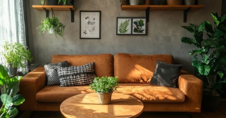
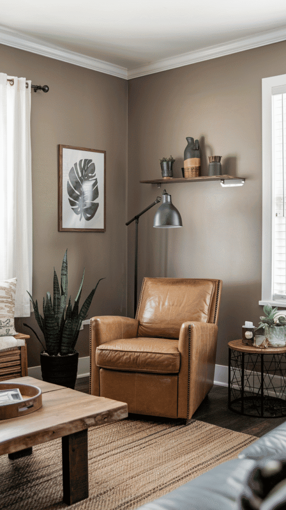
🍄 Taupe & Mushroom: For That Elevated Earthy Feel
Taupe gets a bad rap, but hear me out—it’s beige’s more sophisticated cousin who lives in a tastefully curated loft and reads architectural magazines for fun.
This color brings depth and elegance while still keeping things grounded.
Great taupe and mushroom shades:
- Sherwin-Williams Poised Taupe – the perfect mix of brown and gray.
- Behr Mushroom Bisque – warm, earthy, and oh-so-inviting.
- Farrow & Ball Elephant’s Breath – fancy name, beautiful tone.
Why taupe rocks:
- It’s cozy without being muddy.
- It looks chef’s kiss next to brass or matte gold fixtures.
- It’s ideal for adding moodiness without making the room dark.
Pair with cream trims, dark wood accents, and a ton of plants. Trust me, it’ll look intentional and high-end.
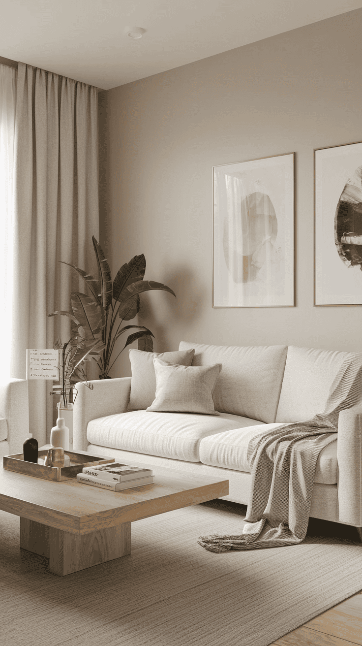
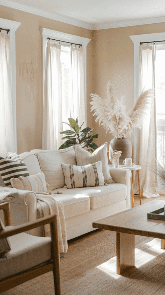
☁️ Creamy Whites: Not Your Basic White
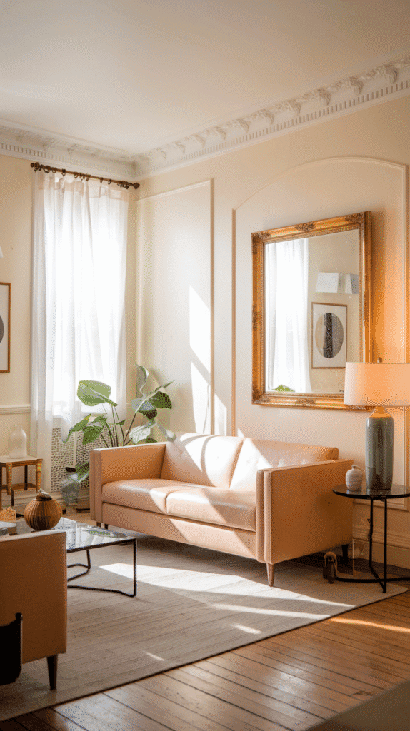
Let’s get one thing straight: not all whites are equal. If you’ve ever painted a room in a “bright white” and wondered why it feels like an operating room… yeah, same.
Creamy whites have warm undertones—yellow, ivory, sometimes even peachy—so they feel soft, not sterile.
Top contenders:
- Benjamin Moore White Dove – everyone’s favorite for a reason. Soft, classic, never harsh.
- Behr Swiss Coffee – warm, mellow, and great with both traditional and modern spaces.
- Farrow & Ball Pointing – a rich, almost buttery tone that pairs well with natural textures.
These shades are perfect if you:
- Want a clean look without feeling cold.
- Need something that works with a lot of color in your decor.
- Live in a darker room and want to bounce light around.
FYI, creamy whites also make your space look bigger. So if your living room is more “apartment cozy” than “Pinterest mansion,” this is a great cheat.
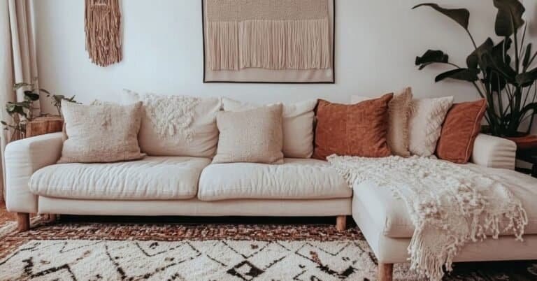
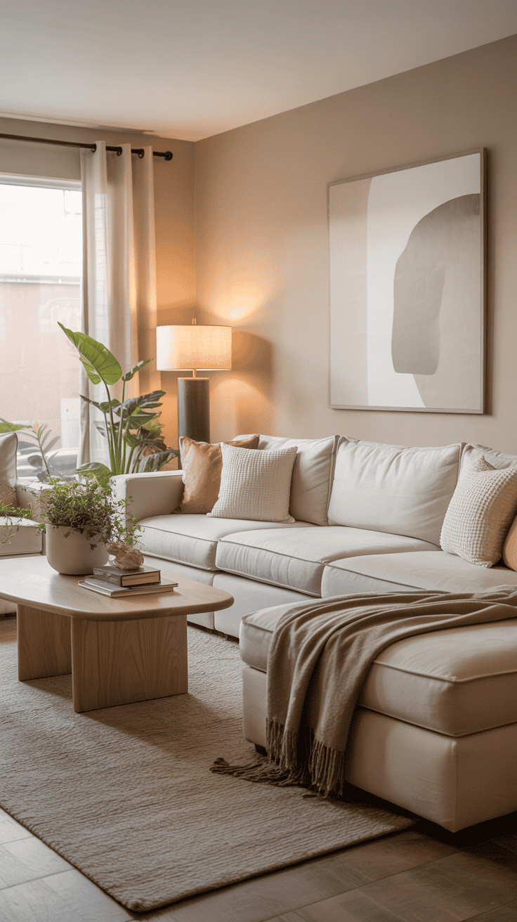
🌾 Earthy Neutrals: Hints of Clay, Sand, and Blush
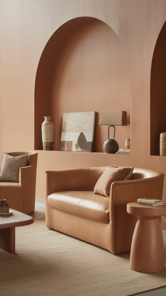
Sometimes beige just doesn’t cut it. Maybe you want a bit of personality without going full “color explosion.” Enter: earthy neutrals with subtle hints of color.
Think:
- Clay pinks
- Soft terracottas
- Pale sands and muted rose tones
Paint colors we love:
- Benjamin Moore Pale Almond – it’s like wearing a soft, blushy nude.
- Sherwin-Williams Malted Milk – peachy and warm, but still neutral.
- Backdrop Sandcastle – a modern desert vibe that feels grounded.
These work beautifully with:
- Leather or velvet sofas.
- Layered textures like jute, linen, and boucle.
- Tons of natural light.
If you want your space to feel warm and unique without going wild, this is your happy middle ground. Bonus: these shades look amazing in golden hour lighting. You’re welcome. 😉
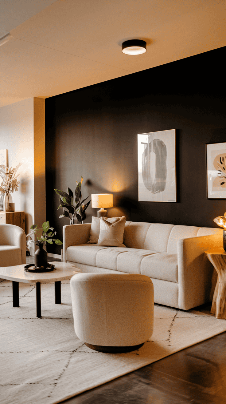
🎯 Accent Walls: Add Contrast Without Going Bold
Not ready to commit to a full room of color? I get it. Enter the accent wall—the ultimate “I’m edgy but also practical” design move.
In a warm neutral room, a deeper tone can add serious drama without the overwhelm.
Ideas to try:
- Sherwin-Williams Urbane Bronze – deep, chocolatey, and seriously chic.
- Behr Spanish Sand – soft terra-cotta energy, minus the overpowering.
- Benjamin Moore Chelsea Gray – moody without being dark AF.
Accent walls work best:
- Behind your couch or TV.
- Around a fireplace.
- In rooms that need a little architectural interest.
Balance your bold wall with lighter surroundings, cozy lighting, and warm-toned decor. You’ll thank yourself every time you walk in.
🧠 How to Pick Your Perfect Warm Neutral
So you’ve got your top contenders. Now what? Before you commit to 5 gallons of “Soft Taupe Serenity,” keep these tips in mind:
Lighting Matters—A Lot
- South-facing rooms love warmer tones.
- North-facing rooms can make some neutrals look flat or cool.
- Always test in both daylight and evening lighting.
Swatch Like a Pro
- Paint at least a 12″x12″ square on each wall.
- Or use peel-and-stick samples (seriously, they’re a game-changer).
- Live with it for a few days. No rush decisions!
Coordinate With Decor
- Look at your floors, trim, and furniture tones.
- Don’t forget about art, curtains, and rugs—they all play a role.
Paint is the backdrop to your life. It’s worth a little testing to make sure it’s the right fit. Think of it as speed dating for your walls 😉
✅ Final Thoughts: Paint Like a Pro (or Just Look Like One)
At the end of the day, warm neutrals are your paint palette power move. They make your living room feel grounded, welcoming, and stylish without screaming for attention.
Whether you go beige, greige, taupe, or creamy white, your space will thank you. And you’ll get that “wow, your place is so cozy!” reaction every time someone walks in.
So go on, grab those swatches and start painting. Just don’t blame me when you fall in love with more than one color. It’s a common side effect 😉

This post shows The Best Paint Colors for a Warm Neutral Living Room!